Web Design
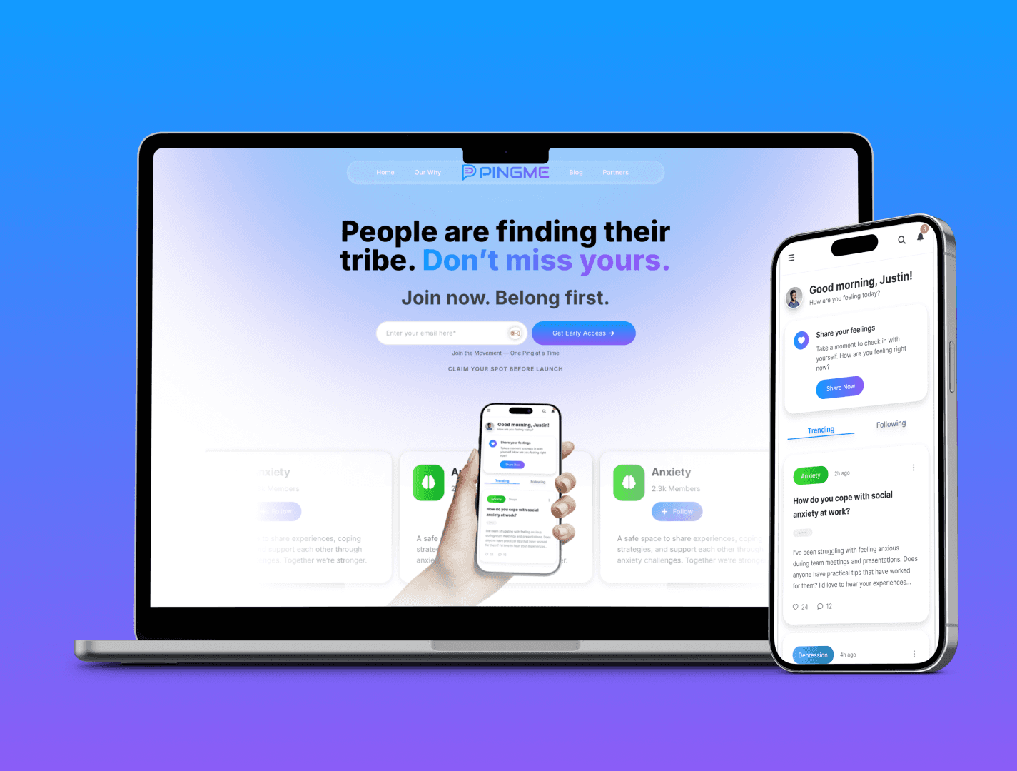
PingMe.World
Designing a focused, modern SaaS website for a communication platform built around presence and connection.
Year :
2025
Industry :
Technology / Communication
Client :
Ping.Me
Project Duration :
2 weeks

Problem :
PingMe needed a website that clearly communicated the value of their app while establishing credibility as a modern SaaS product.
Their platform introduces a simple but powerful idea: giving users control over their availability and presence. But the existing web presence didn’t yet reflect the clarity, confidence, and focus required to support that message.
The challenge was to design a website that felt modern, trustworthy, and intuitive - while helping users quickly understand what PingMe is, how it works, and why it matters.
This wasn’t just about aesthetics. It was about creating alignment between the product’s purpose and its digital presence.
Solution :
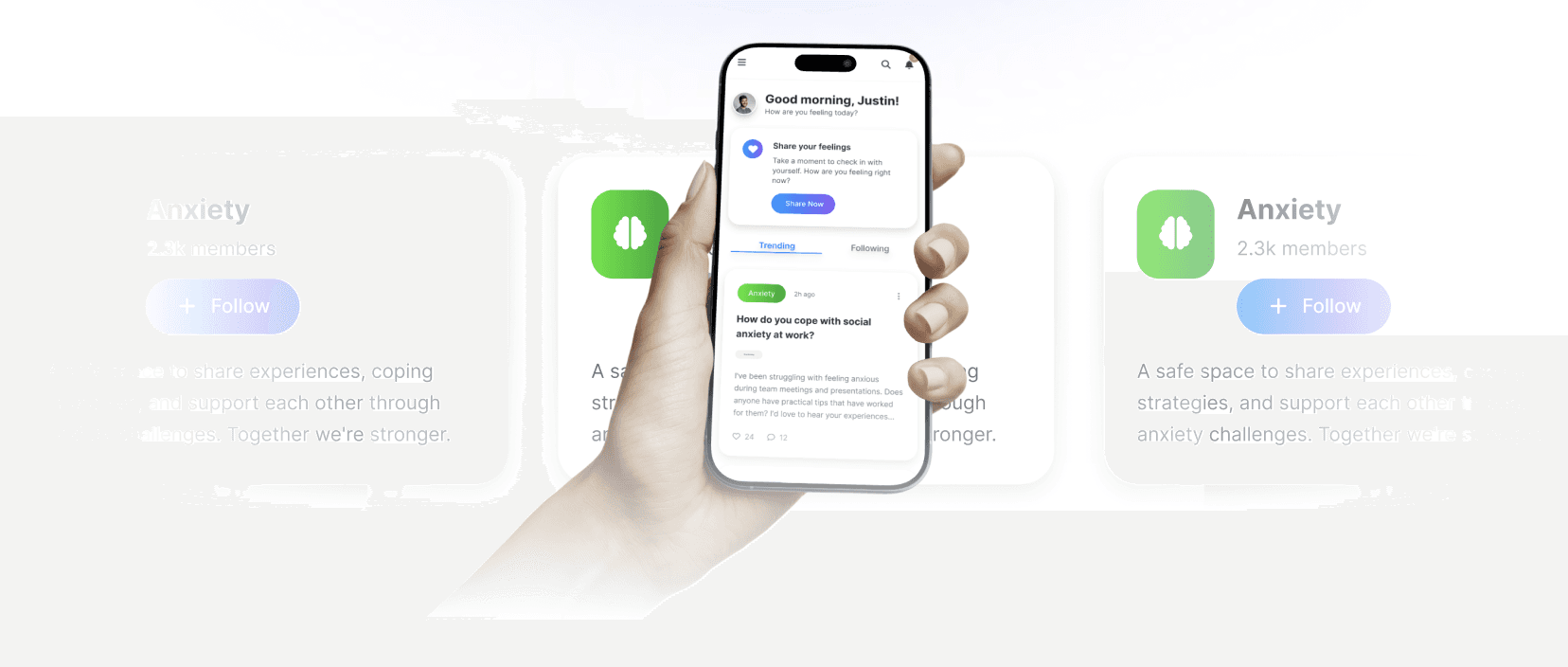
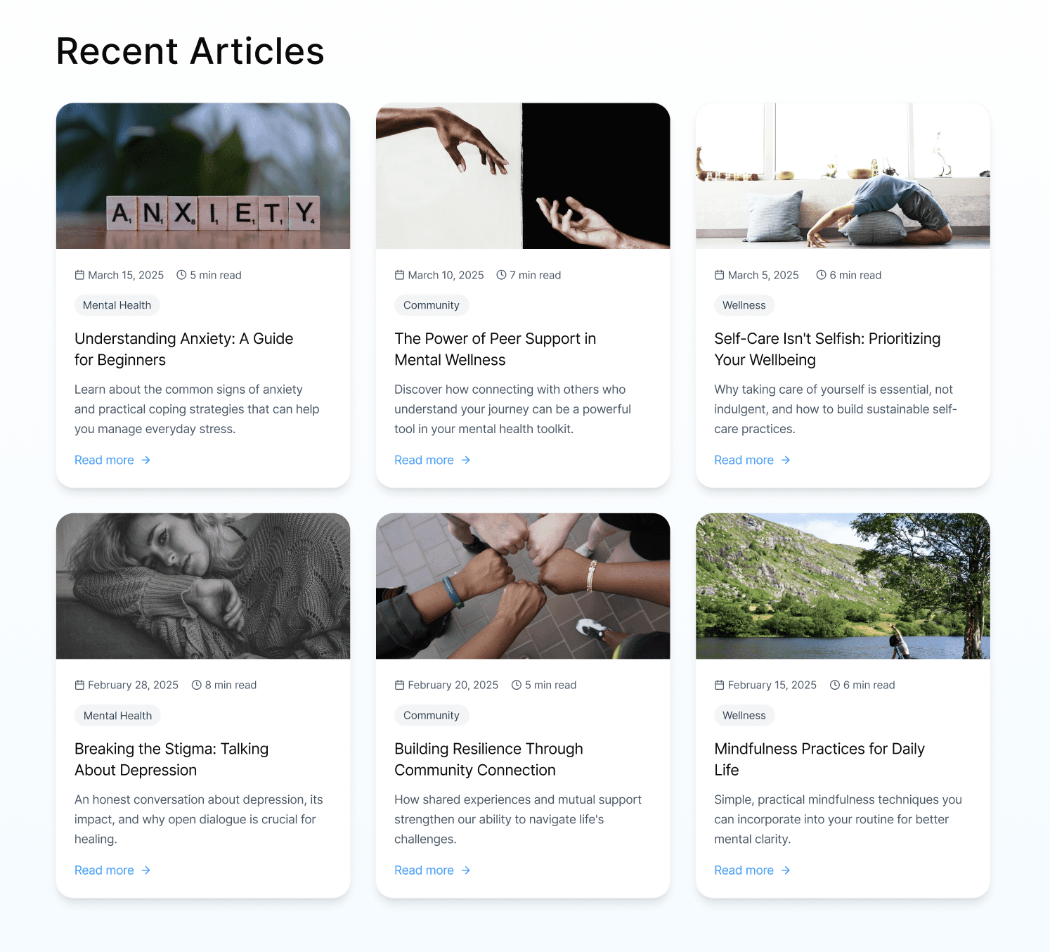
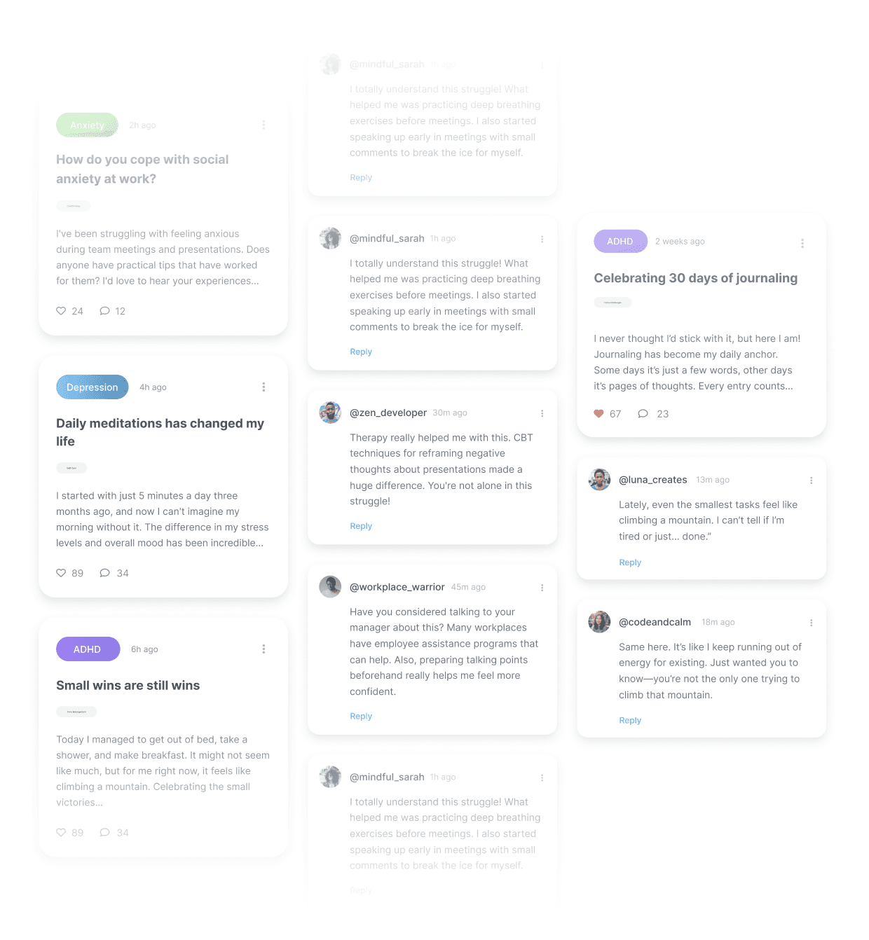
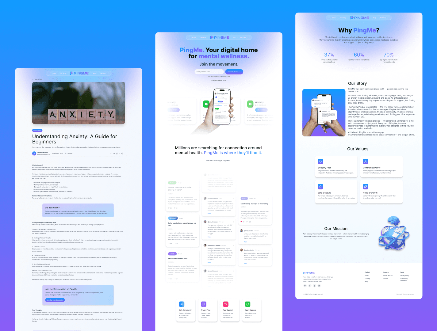
I designed a clean, structured marketing website built around clarity, hierarchy, and intentional pacing.
The layout guides users naturally through the story of the product, introducing the core concept, reinforcing value, and supporting understanding through thoughtful visual structure.
Every element was designed to reduce friction and increase confidence:
• Clear typographic hierarchy for immediate comprehension
• Focused use of whitespace to create breathing room
• Intentional layout structure to guide attention and flow
• Modern SaaS design patterns that users instinctively trust
The result is a website that feels calm, capable, and aligned with the product’s vision.
Not distracting. Not overwhelming. Just clear.
Challenge :
The primary challenge was translating an abstract product concept - presence and availability - into something tangible and immediately understandable.
This required careful attention to communication, structure, and visual hierarchy.
The design needed to:
• Establish credibility quickly
• Communicate the product’s purpose without over-explaining
• Feel modern without relying on trends
• Support both first-time visitors and returning users
Every decision was made to reduce cognitive load and create a sense of clarity and trust.
Because when users understand something instantly, they trust it.
Summary :
This project reflects my approach to product and marketing website design: clarity first.
The PingMe website was designed to create alignment between the product’s vision and the user’s experience, translating abstract ideas into something concrete, intuitive, and approachable.
Through intentional structure, thoughtful pacing, and careful restraint, the design supports the product without competing with it.
More Projects


Web Design
PingMe.World
Designing a focused, modern SaaS website for a communication platform built around presence and connection.
Year :
2025
Industry :
Technology / Communication
Client :
Ping.Me
Project Duration :
2 weeks
Problem :
PingMe needed a website that clearly communicated the value of their app while establishing credibility as a modern SaaS product.
Their platform introduces a simple but powerful idea: giving users control over their availability and presence. But the existing web presence didn’t yet reflect the clarity, confidence, and focus required to support that message.
The challenge was to design a website that felt modern, trustworthy, and intuitive - while helping users quickly understand what PingMe is, how it works, and why it matters.
This wasn’t just about aesthetics. It was about creating alignment between the product’s purpose and its digital presence.
Solution :
I designed a clean, structured marketing website built around clarity, hierarchy, and intentional pacing.
The layout guides users naturally through the story of the product, introducing the core concept, reinforcing value, and supporting understanding through thoughtful visual structure.
Every element was designed to reduce friction and increase confidence:
• Clear typographic hierarchy for immediate comprehension
• Focused use of whitespace to create breathing room
• Intentional layout structure to guide attention and flow
• Modern SaaS design patterns that users instinctively trust
The result is a website that feels calm, capable, and aligned with the product’s vision.
Not distracting. Not overwhelming. Just clear.
Challenge :
The primary challenge was translating an abstract product concept - presence and availability - into something tangible and immediately understandable.
This required careful attention to communication, structure, and visual hierarchy.
The design needed to:
• Establish credibility quickly
• Communicate the product’s purpose without over-explaining
• Feel modern without relying on trends
• Support both first-time visitors and returning users
Every decision was made to reduce cognitive load and create a sense of clarity and trust.
Because when users understand something instantly, they trust it.
Summary :
This project reflects my approach to product and marketing website design: clarity first.
The PingMe website was designed to create alignment between the product’s vision and the user’s experience, translating abstract ideas into something concrete, intuitive, and approachable.
Through intentional structure, thoughtful pacing, and careful restraint, the design supports the product without competing with it.
More Projects
Web Design
PingMe.World
Designing a focused, modern SaaS website for a communication platform built around presence and connection.
Year :
2025
Industry :
Technology / Communication
Client :
Ping.Me
Project Duration :
2 weeks
Problem :
PingMe needed a website that clearly communicated the value of their app while establishing credibility as a modern SaaS product.
Their platform introduces a simple but powerful idea: giving users control over their availability and presence. But the existing web presence didn’t yet reflect the clarity, confidence, and focus required to support that message.
The challenge was to design a website that felt modern, trustworthy, and intuitive - while helping users quickly understand what PingMe is, how it works, and why it matters.
This wasn’t just about aesthetics. It was about creating alignment between the product’s purpose and its digital presence.
Solution :
I designed a clean, structured marketing website built around clarity, hierarchy, and intentional pacing.
The layout guides users naturally through the story of the product, introducing the core concept, reinforcing value, and supporting understanding through thoughtful visual structure.
Every element was designed to reduce friction and increase confidence:
• Clear typographic hierarchy for immediate comprehension
• Focused use of whitespace to create breathing room
• Intentional layout structure to guide attention and flow
• Modern SaaS design patterns that users instinctively trust
The result is a website that feels calm, capable, and aligned with the product’s vision.
Not distracting. Not overwhelming. Just clear.
Challenge :
The primary challenge was translating an abstract product concept - presence and availability - into something tangible and immediately understandable.
This required careful attention to communication, structure, and visual hierarchy.
The design needed to:
• Establish credibility quickly
• Communicate the product’s purpose without over-explaining
• Feel modern without relying on trends
• Support both first-time visitors and returning users
Every decision was made to reduce cognitive load and create a sense of clarity and trust.
Because when users understand something instantly, they trust it.
Summary :
This project reflects my approach to product and marketing website design: clarity first.
The PingMe website was designed to create alignment between the product’s vision and the user’s experience, translating abstract ideas into something concrete, intuitive, and approachable.
Through intentional structure, thoughtful pacing, and careful restraint, the design supports the product without competing with it.